CRITICAL ANALYSIS + RESEARCH PAPER Project Overview
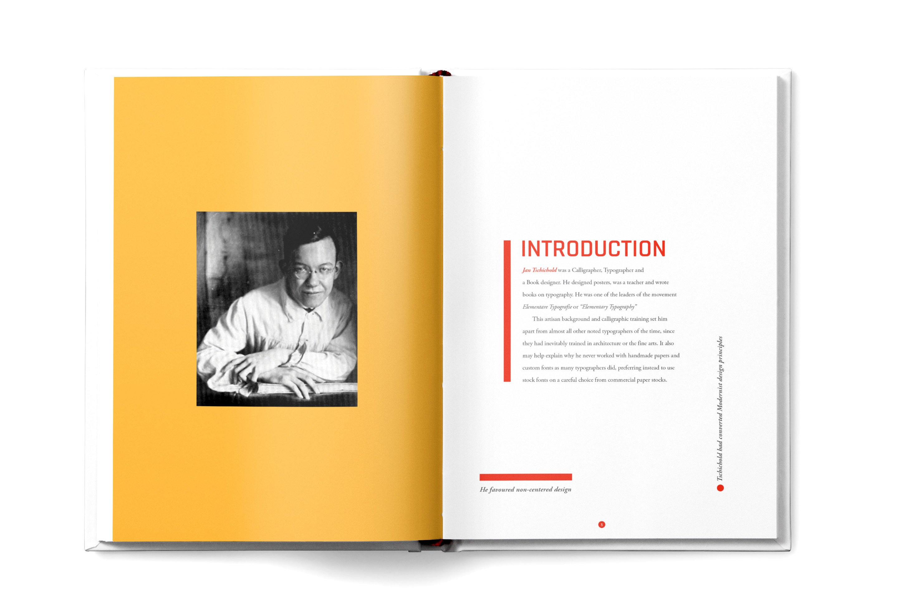
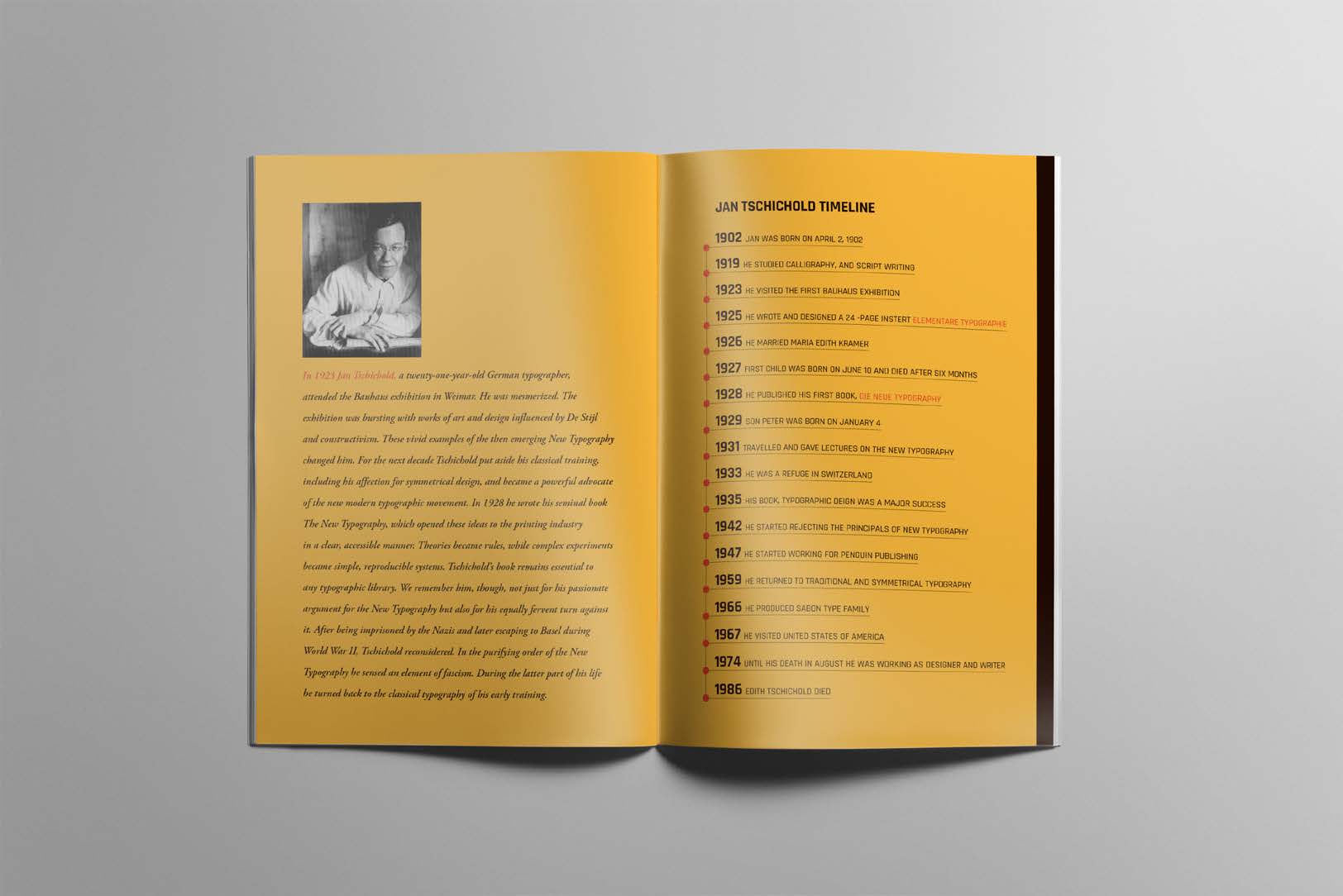
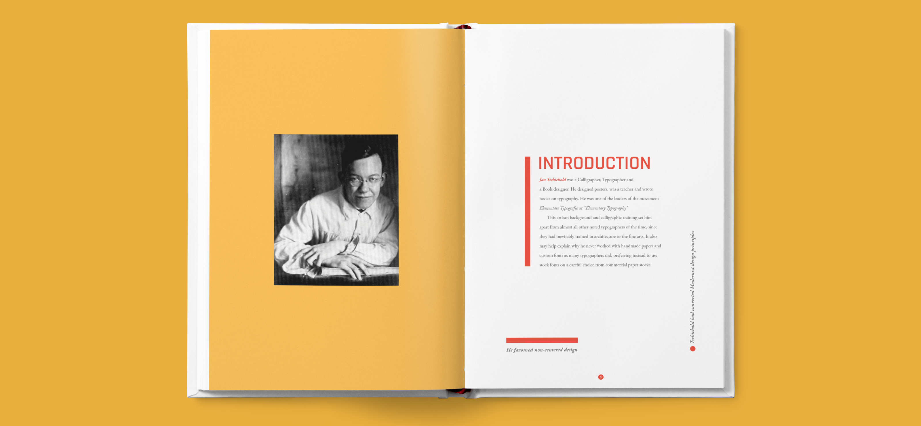
A major component of this course work was a research paper. This paper provided much of the content that I used to design a small exhibition catalog in the second half of the course. I began with a critical analysis of the visual communication theory. I was interested in the history of typography and graphic design. And so, in the process of critical analysis, I closely examined Jan Tschichold’s essay on “The New Typography” written in 1928. This helped me understand why Tschichold chose to write this text in a particular way for a specific audience and the purpose it ultimately helped serve.
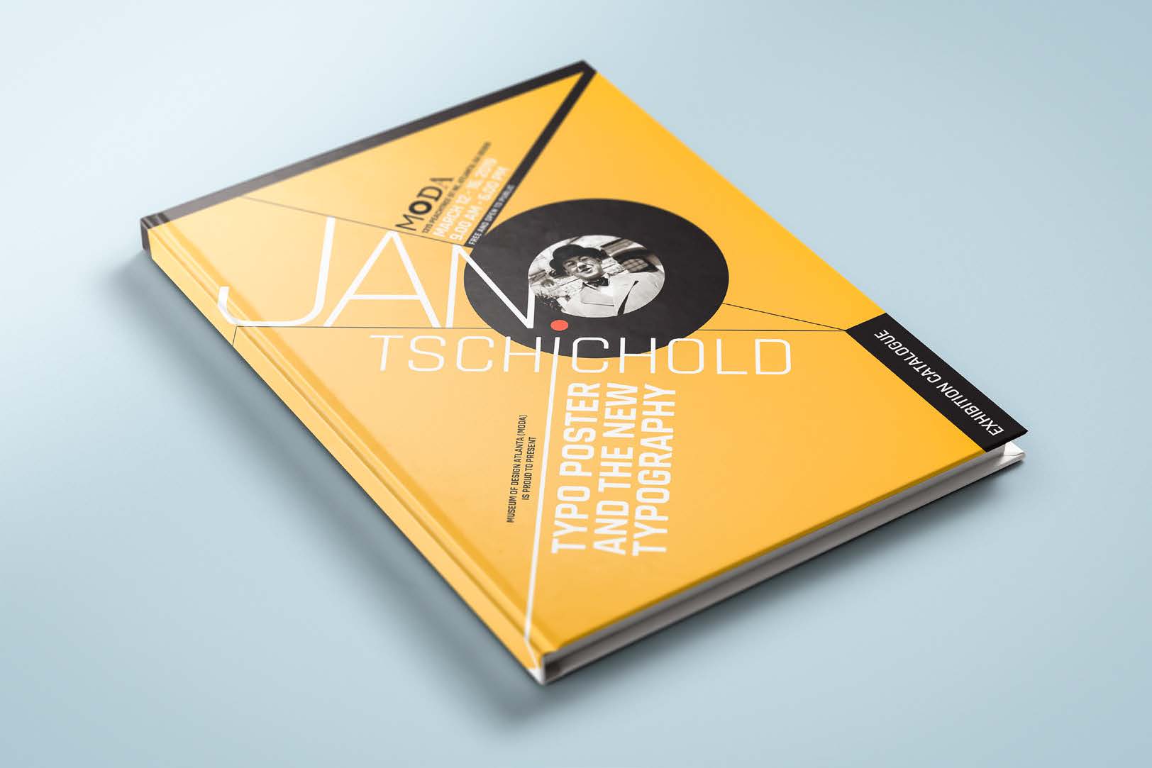
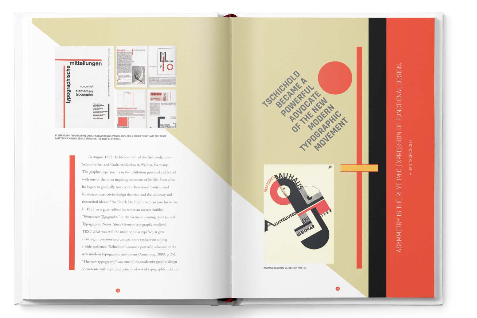
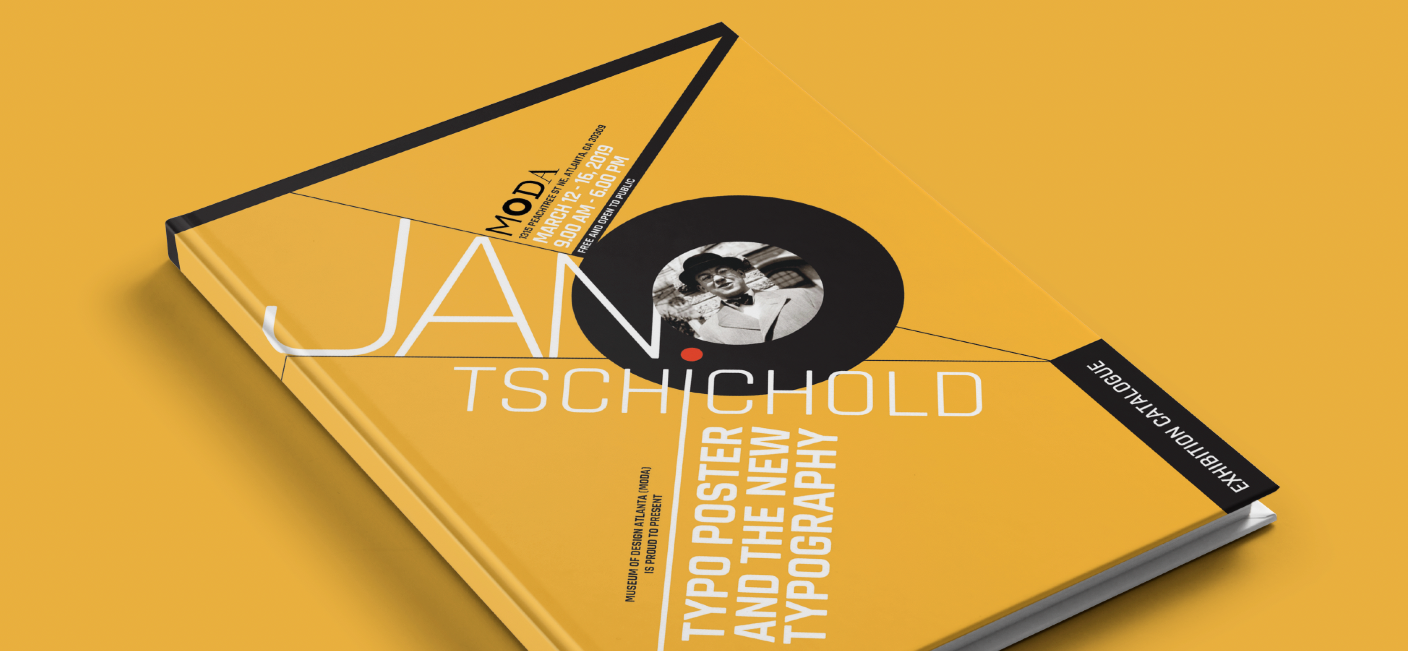
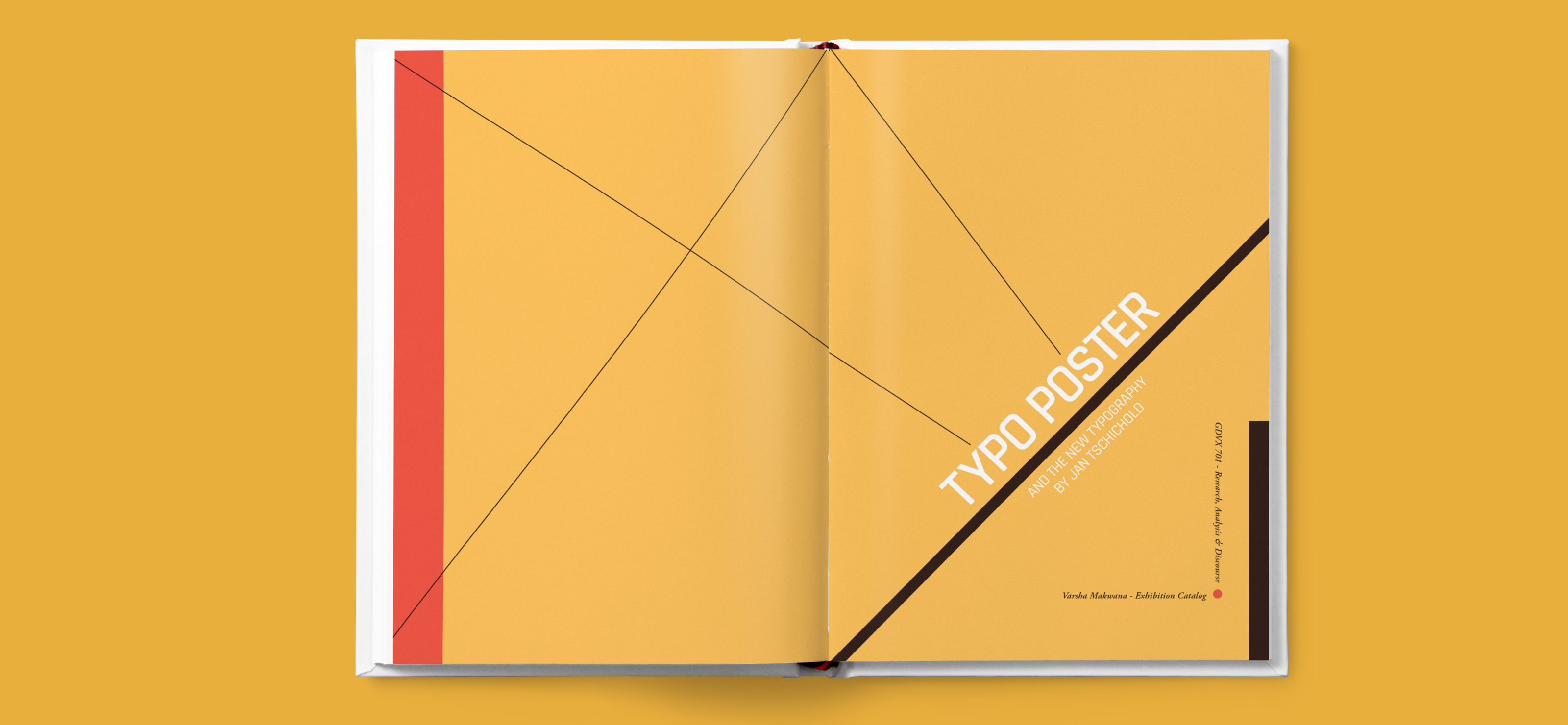
In the 1920s and 1930s, the so-called New Typography movement brought graphics and information design to the forefront of the artistic avant-garde in Central Europe. Rejecting traditional arrangement of type in symmetrical columns, modernist designers organized the printed page or poster as a blank field in which blocks of type and illustration (frequently photomontage) could be arranged in harmonious, strikingly asymmetrical compositions. Taking this lead from currents in Soviet Russia and at the Weimar Bauhaus, designer Jan Tschichold codified the movement with accessible guidelines in his landmark book Die Neue Typographie (1928). Almost overnight, typographers and printers adapted this way of working for a huge range of printed matter, from business cards and brochures to magazines, books, and advertisements. This exhibition catalog of posters and numerous small-scale works is drawn from a rich collection of Soviet Russian, German, Dutch, and Czechoslovakian graphics. They represent material from Tschichold’s own collection, which supported his teaching and publication from around 1927 to 1937.
Client and Audience
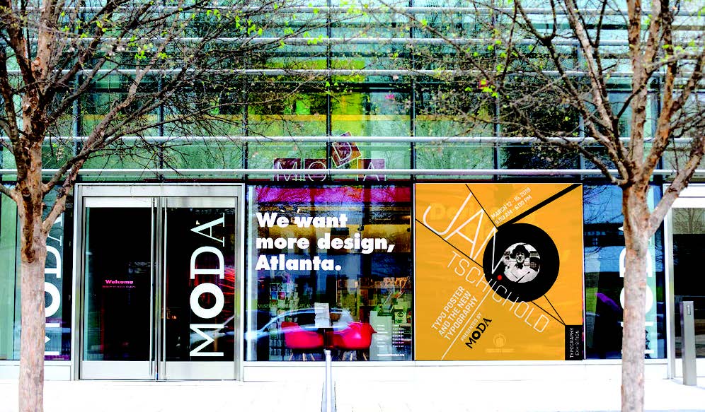
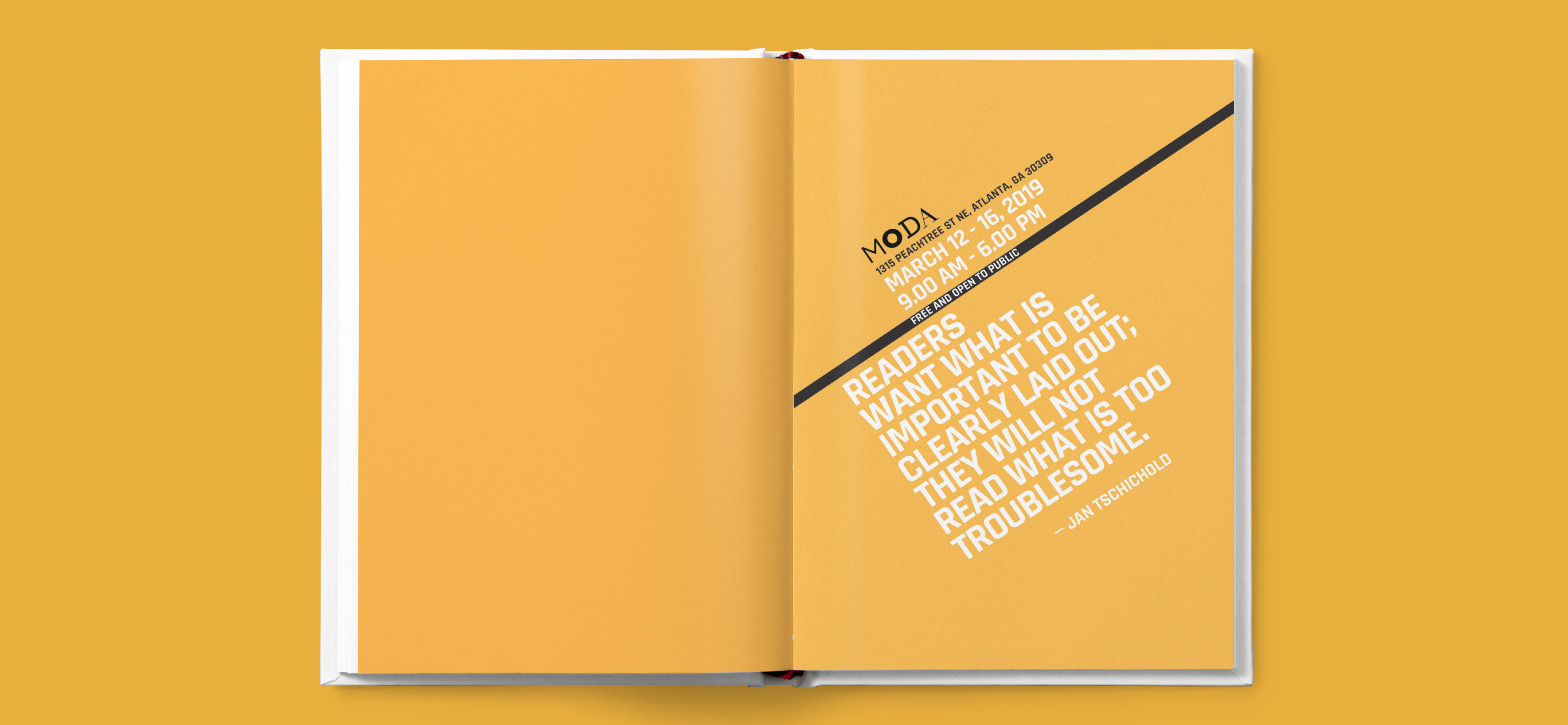
This exhibition is curated by Museum of Design Atlanta (MoDA), the only museum in the South-East
devoted exclusively to the study and celebration of all things design. The target audience includes graphic designers, typographers, art exhibition lovers and those interested in getting to know the origin of “The New Typography” and “Jan Tschichold”.
Design goals/objectives
“The New Typography” has become the standard textbook for typographers and has had a great influence on both past and present-day designers as well as students who want to learn graphic design. Through this exhibition catalog, I wish to bring to light a deeper understanding on The New Typography wave and Jan Tschichold.
Design layout and development
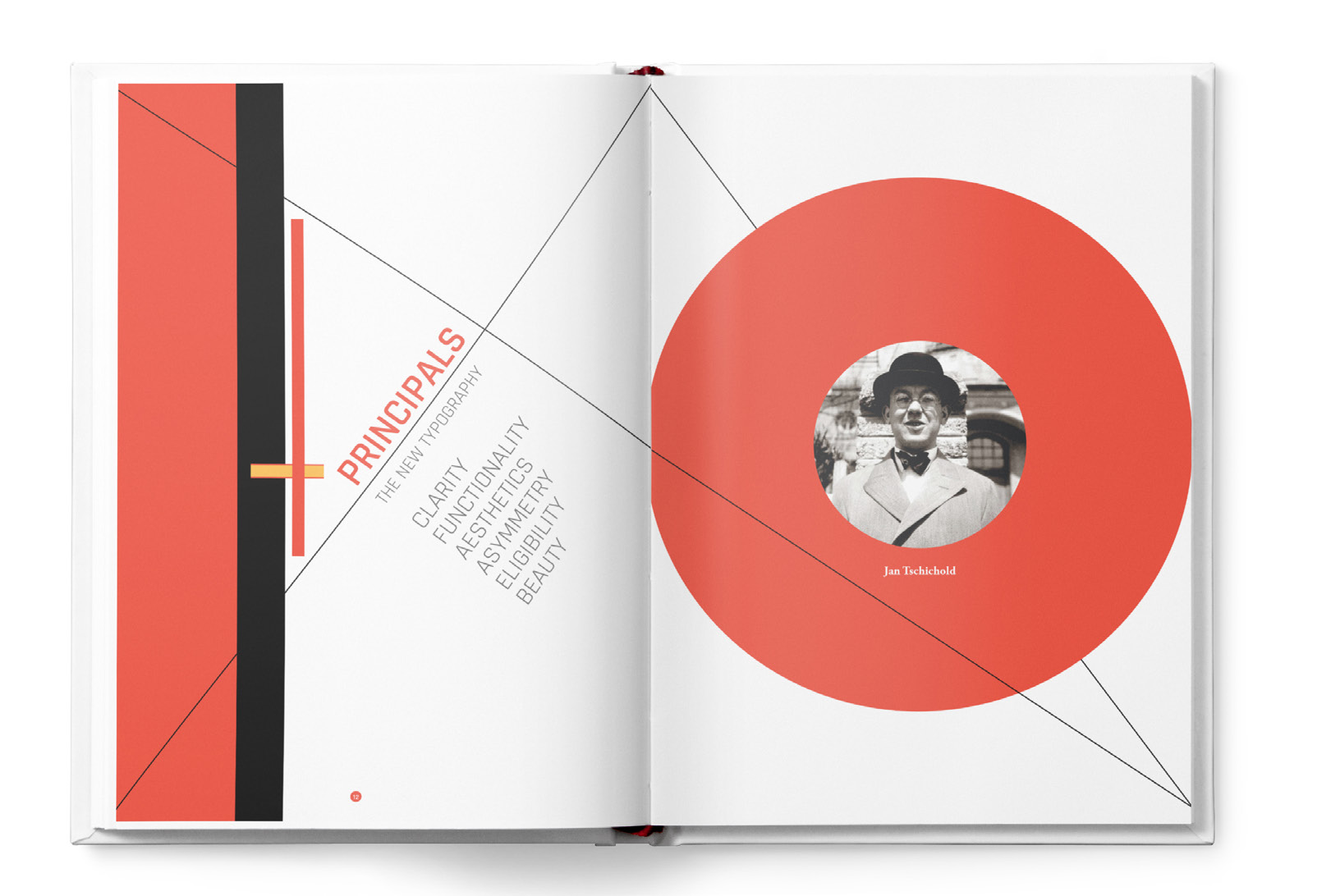
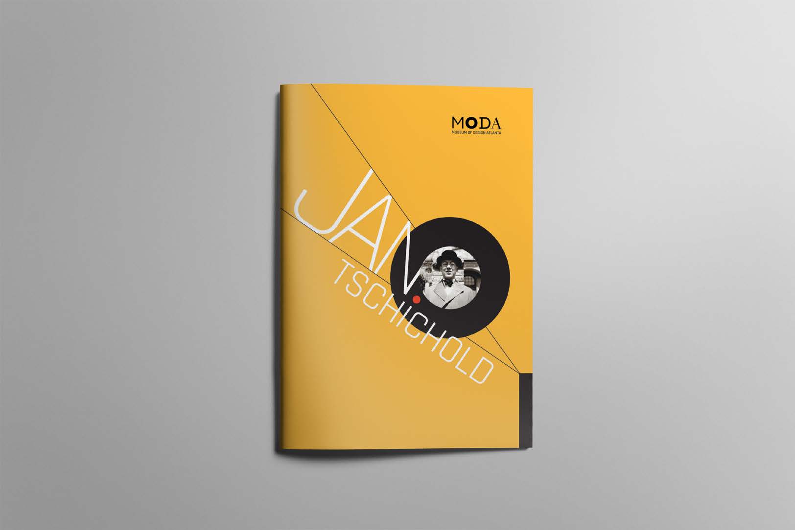
The design and development of this exhibition catalog is inspired by Jan Tschichold’s work and principles but takes into consideration the current trend for layouts, which is cleaner and clutter-free. Typefaces used are Rajdhani for headline, subhead, quotes while the body typeface is Adobe Garamond Pro. These typefaces aligned well with Jan Tschichold cornerstone principles of clarity, functionality and aesthetics. The color palette is yellow, red and yellow perch, all inspired from Jan Tschichold’s artwork.
Print production
The cover of this catalog is hardbound and inside is 250gsm matte. Jan Tschichold’s principle is printed on a transparent sheet for deeper and clearer understanding. A gate fold poster. Overall, CMYK digital colour printing.
Outcome
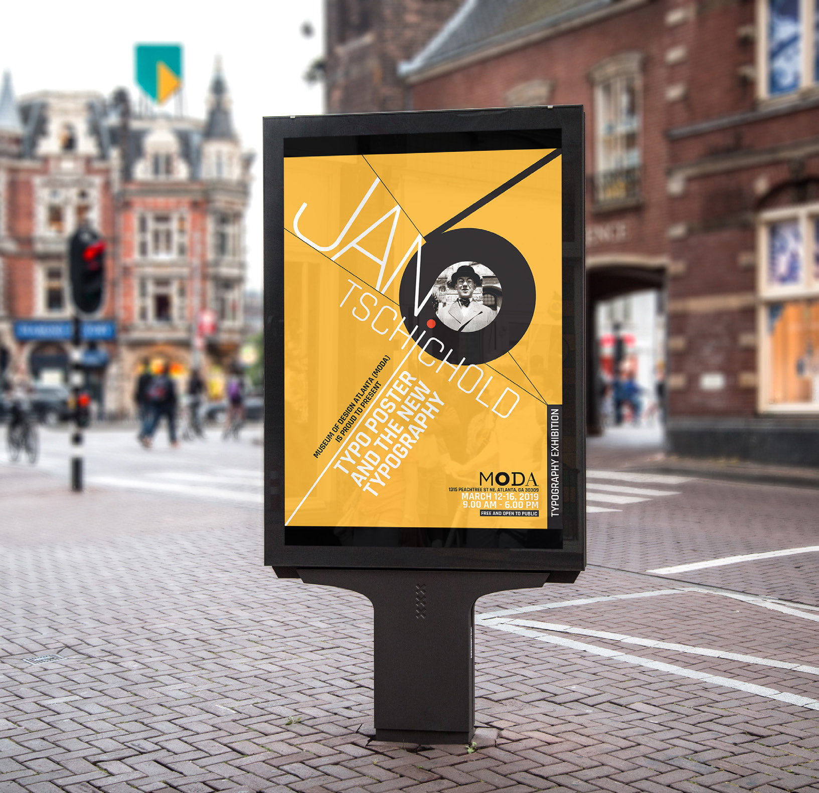
Exhibition catalog, Sticker tickets, Brochure, Motion E- invite and Poster.
Exhibition Catalog Process book